LOLA understands women's intimacy but not conversion copywriting.
The title might be harsh but that's exactly how I felt after looking at LOLA's amazing products not getting the well-deserved messaging on the homepage.
Firstly, there aren't a lot of brands that understand what intimacy means for women. And then, most of them don't know how to create the right products in this category.
LOLA caught my attention for the right reasons. It understands both and it can be reflected through the products.
If you are a DTC brand in the female wellness space, keep an eye out for the mistakes they made and don't repeat them on your homepage.
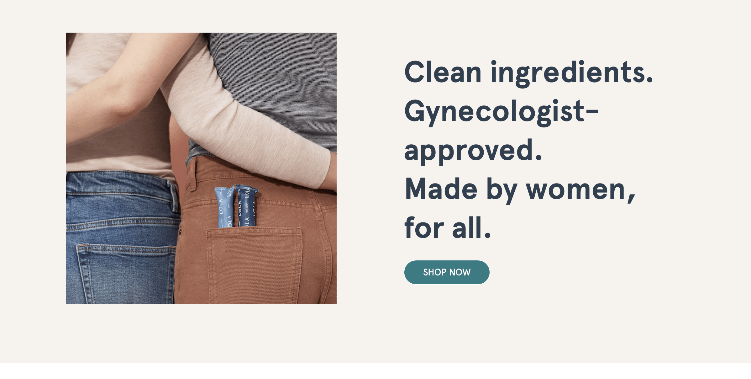
HERO is a win
I usually have 3 main questions whenever I see another female intimacy product.
what if they have hidden chemicals?
what if they don’t know what they are doing? did they even consult someone qualified enough for QC?
who made it? are women involved in the production or they've just made these products based on assumptions?
Gladly, the LOLA hero section answers all these.
‘Clean ingredients. Gynecologist-approved. Made by women, for all.’
no unwanted harmful chemicals in the ingredients
makes me believe someone is approving and validating these with a gyne-approved tag
'made by women'
So, this section is a win-win.
Product categories are adding friction to the homepage
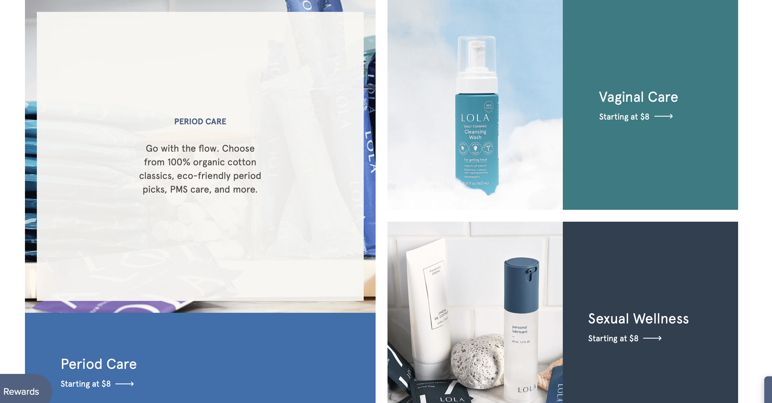
I like the 3 quick categories and the microcopy that goes with it. But, taking me to a different page might not be a great idea.
Maybe the user doesn’t know what they want at this point
This might be a distraction while they are exploring
I haven’t figured out why women are buying LOLA yet so checking individual products won’t make sense
Bestsellers don't have the 'best placement' on the homepage
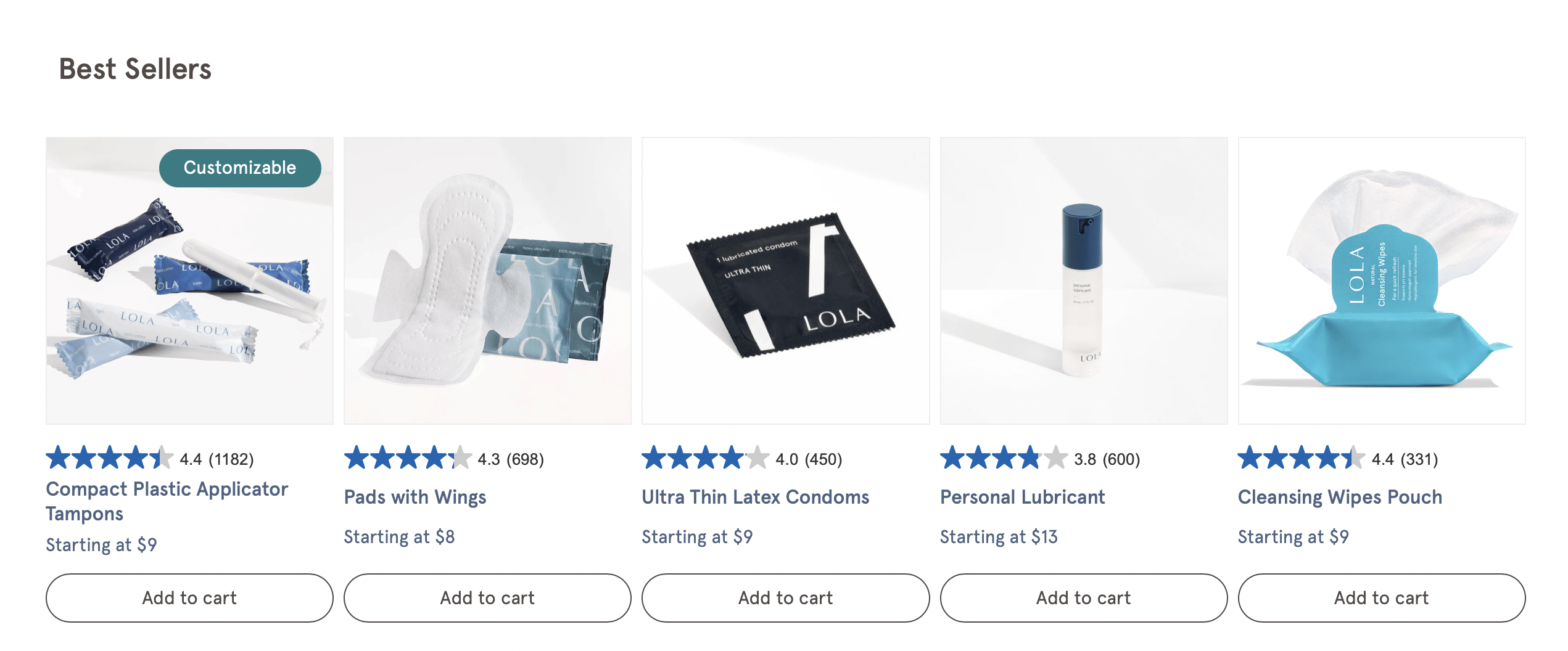
The ‘ bestsellers’ section shouldn't have been a part of this flow for 2 main reasons.
The bestsellers might not make sense to everyone until they know the category they prefer.
Ratings/stars are great but I'd have to read reviews or the hype won't make sense to me.
A half-cooked bestsellers section just listing the products without a preview of user reviews isn't a great idea.
Please show them what female condoms really look like
Female condoms are a whole different topic for some women. There should be a visual description to help some women navigate here. Maybe a creative doodle? I mean, it's 2024, we can't shy away from that.
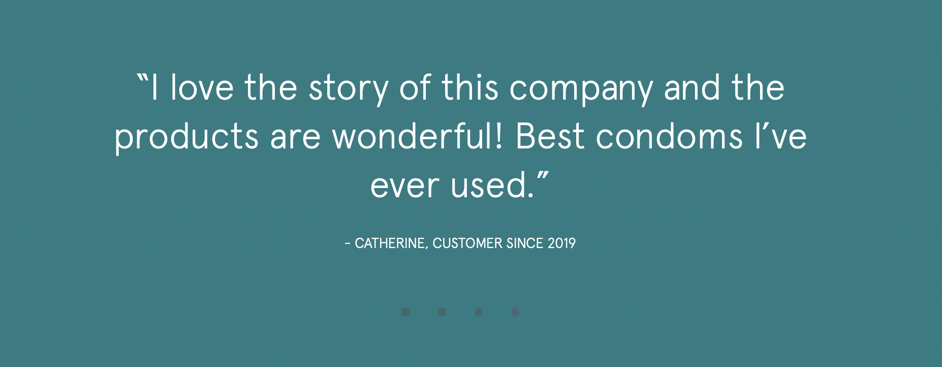
Users would love to see the beautiful women who wrote these reviews:")
Here's what I feel is missing in these stories -
I can't see or verify if these are all real people. I need pictures.
The stories are so short and sound like an advertisement.
More than the exceptional results people saw with the products if they show me the impact these products made in their life, it'll connect me with their mission even better.
Last thoughts before we go our separate ways...
The website ended abruptly for me because there were a lot of unanswered questions.
The landing page needs a 'how to use these products' section for women who aren't visual thinkers.
It also needs more social proof or the existing proof depicted in a better way.
More organic stories from women will help ease the decision-making process.
Better positioning framework that reflects in the message/copy.
The website has a great design but the message doesn't match that.
This was a micro teardown for LOLA. If you want a full copy teardown of your website message and UI/UX flow, simply fill out this contact form.