Sugar Cosmetics: Is the copy way too sweet for me?
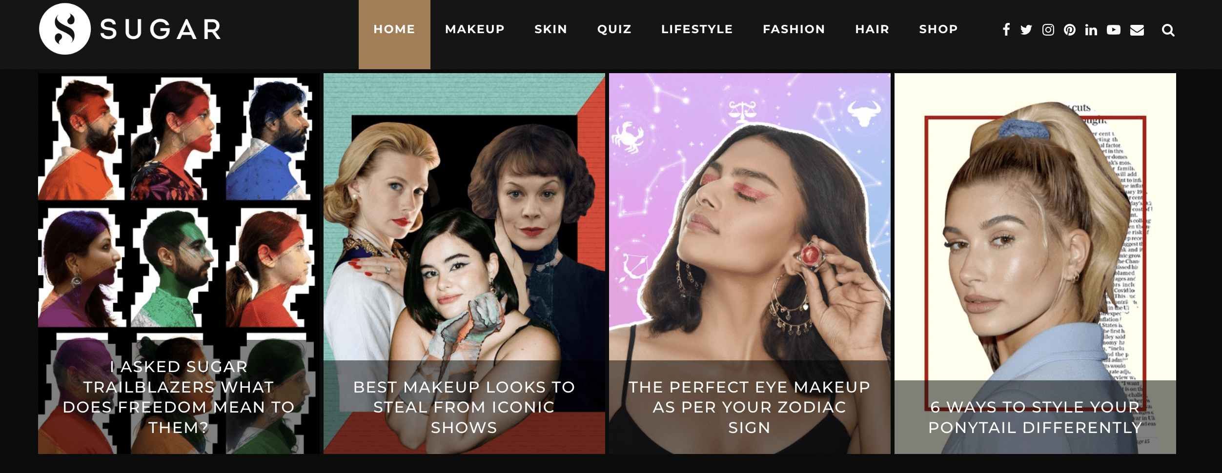
I just have one question for the CRO expert handling this website - does the constantly moving hero section get better results?
Because, in my opinion, this is a CRO disaster. You are offering multiple CTAs to a single user and not even letting them decide what they want because the section is constantly moving.
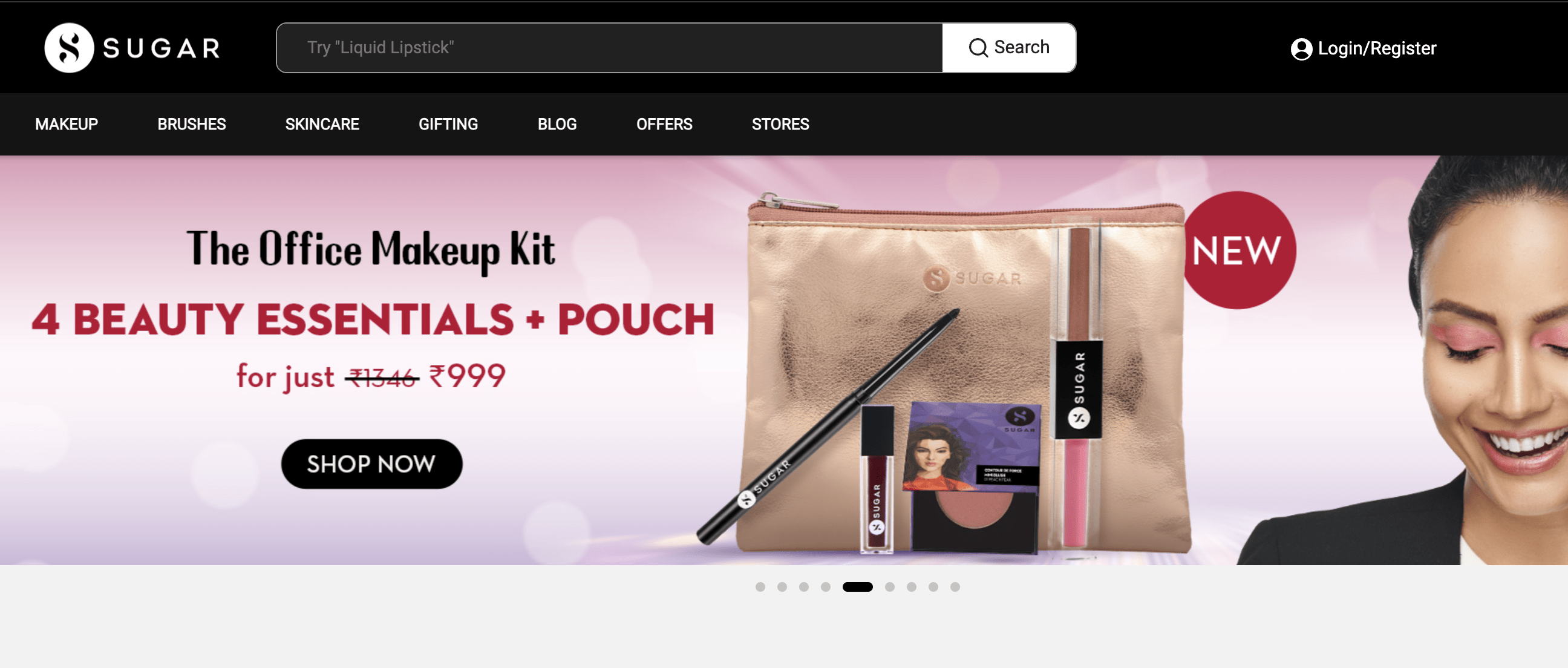
I see the moving banners and some of them also have discounts but I just can’t focus. It’s super distracting.
There was a foundation stick with a benefit saying -lasts more than 12 hours, which I believe is exceptional. But, again, the message is not sticking.
Next up - Bestsellers
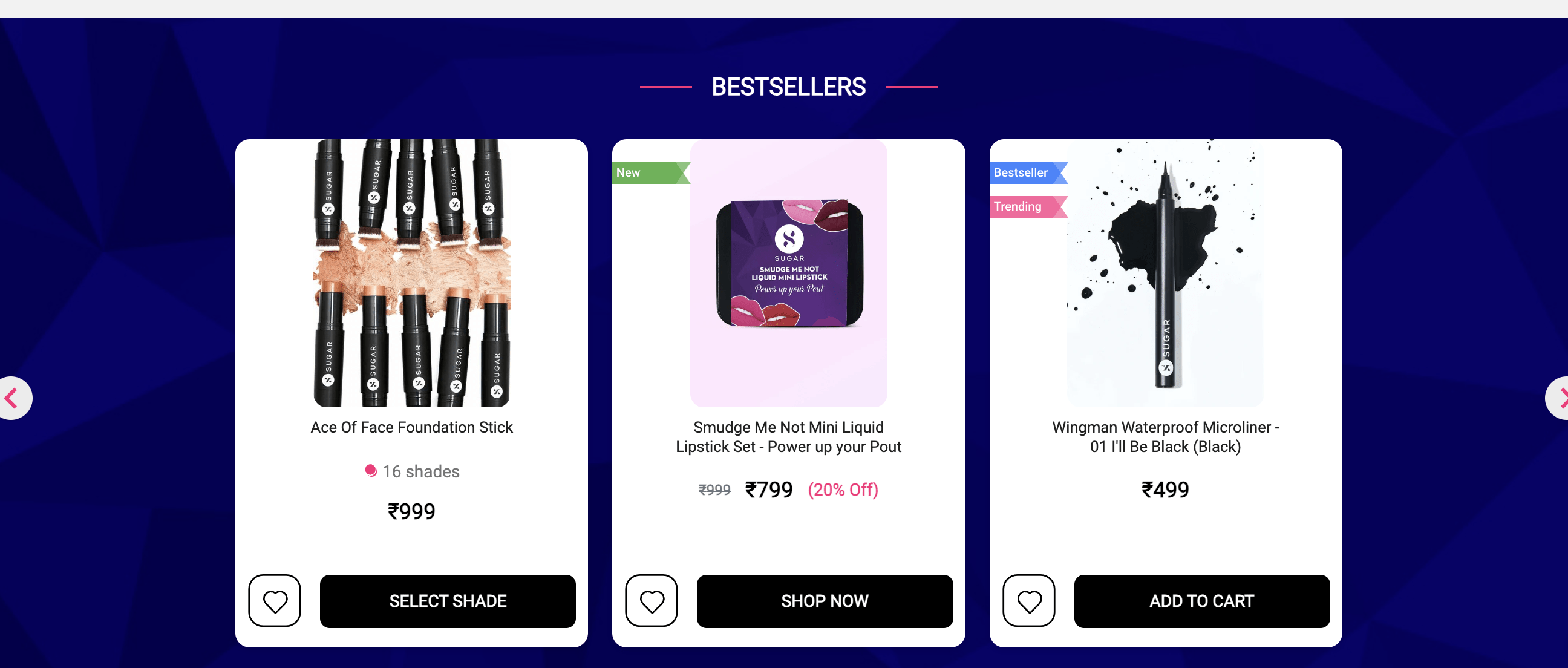
I know they are bestsellers for a reason but I would like to see the ratings and reviews as well.
The section is clean in terms of design but isn’t persuasive.
Overall, the page might be doing great in terms of revenue or conversion. At this point, my analysis is just from the point of view that people who are visiting the website, but not buying anything, I really wanna convert all of them. So I’m basically optimizing for the bounce rate. They just couldn’t see the best parts of the brand. So I want them to do that. And this is why the analysis.
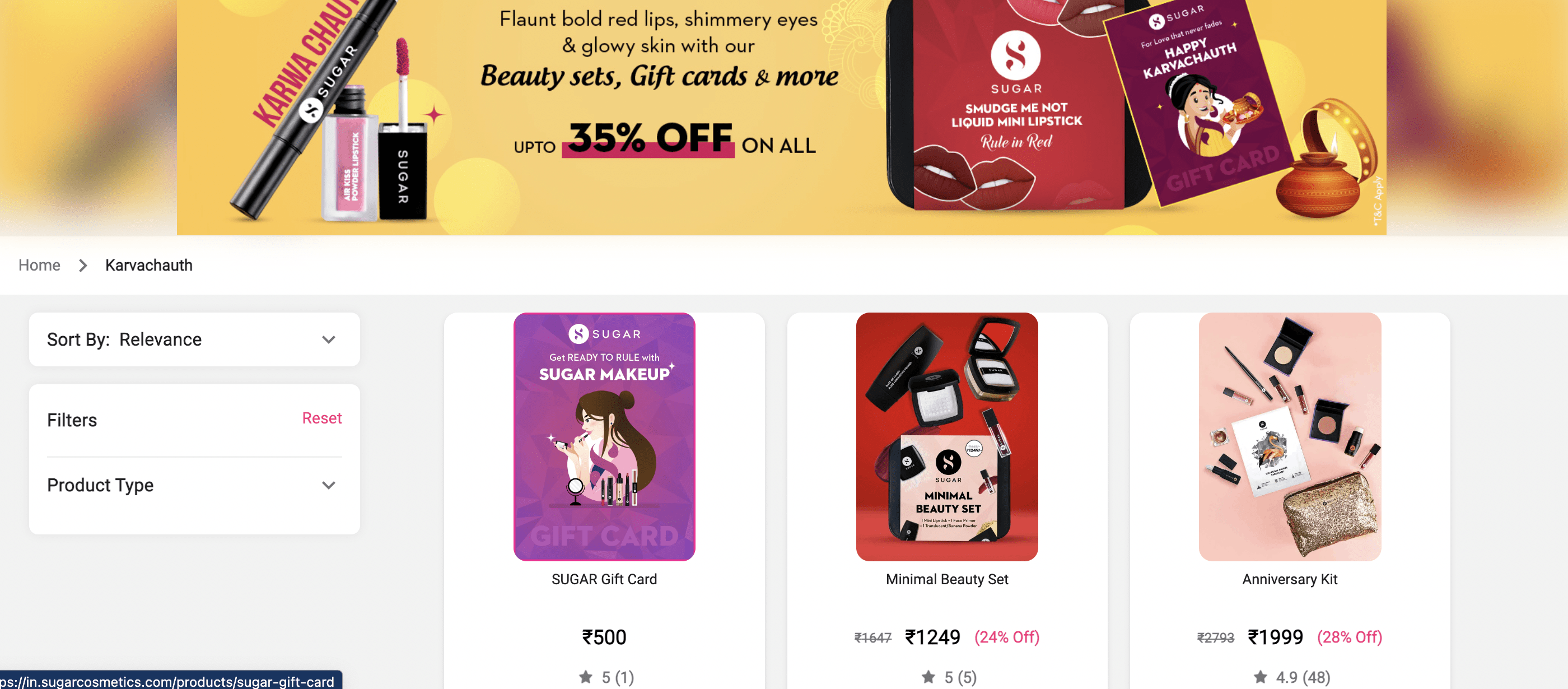
Hot Deals. Are they?
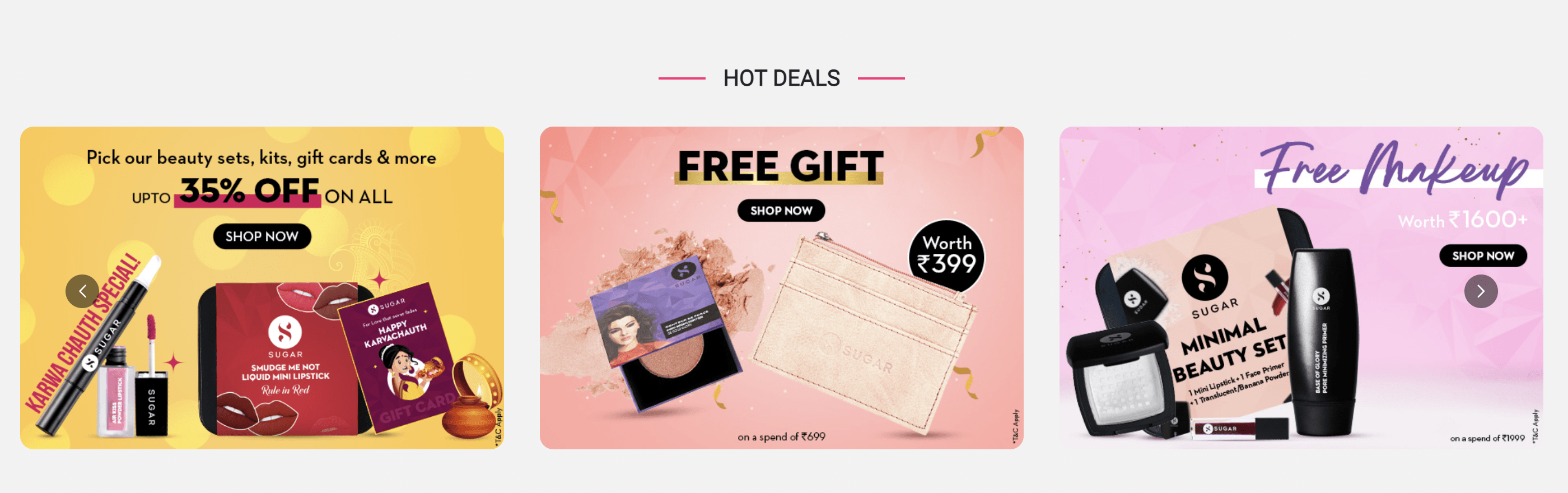
Okay, let’s do what I love the most. Situations.
Situation 1: I like one of the deals under hot deals and click on it.
Situation 2: Scroll to the next section
Situation 1 in detail: I click on the first option to see the beauty sets and gift cards they have to offer.
What I notice is that most products don’t have enough reviews and I immediately slide back or close the tab.
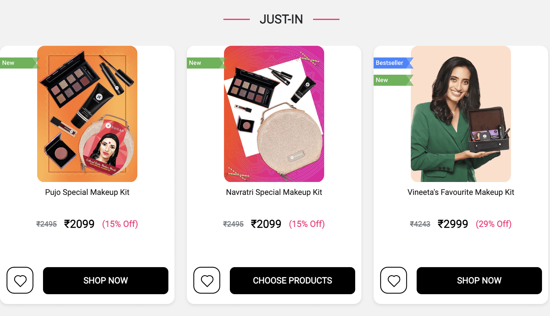
'Just in' Isn't exciting enough
Situation 2 in detail:
I scroll down only to find out that the ‘just in’ kits are way too expensive and without much social proof.
In any of the above scenarios, they are losing users. No matter what your goal or focus is, a user leaving a website without buying anything isn’t great for any business.
The homepage should actually make it easy for people to decide what they want. This is why they should focus on one, one element at a given time. Um, Gifting is great, but they could group some things under one category to avoid overwhelming the user.
This a micro-analysis. If you want a full Copyteardown of Sugar Cosmetics or your own brand, you can reach out to me at kanika@copyteardowns.com or simply fill out this contact form.