Lenskart: Can I see anything clearly?

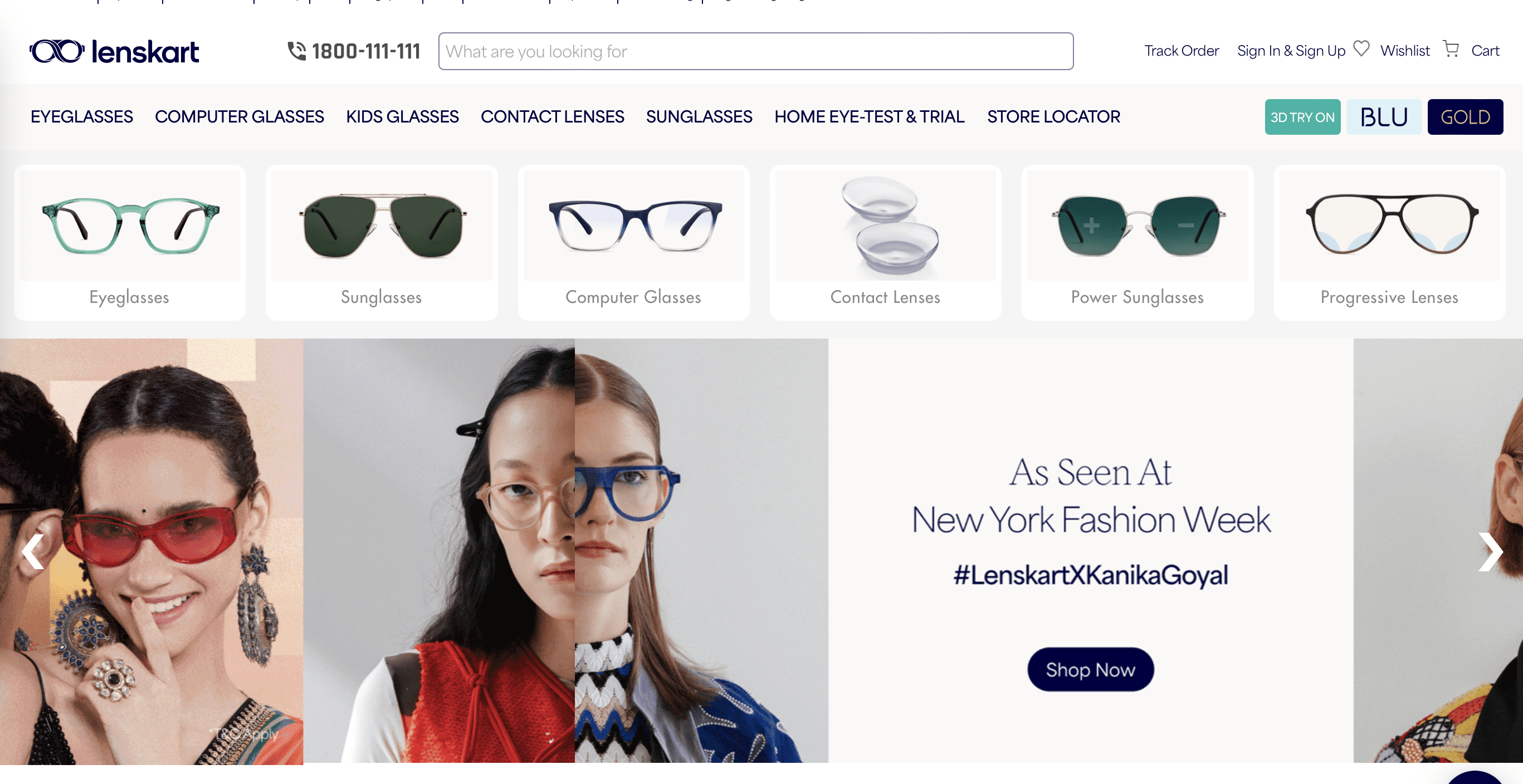
Okay, so, the first thing I notice on the website is absolutely nothing. There’s so much noise and clutter that I can’t focus on anything.
I do see a bunch of fresh faces and it looks exciting to see them with the glasses but nothing is sticking at this point.
Okay, let's move on.
Let me make this micro teardown super specific by creating hypotheses and situations.
Situation 1: Someone who knows exactly what they want to buy. They open the website, select the category and start searching.
Situation 2: Someone who visited the site after a discount offer and knows exactly where they can fetch it.
Situation 3: Clueless users who have no idea what they want. They haven’t considered a discount yet and just want to find out more about the brand and products.
My goal is to optimize the page for the % of users in situation 3.
For everyone who is still deciding about what they want to buy, there are a lot of CTAs on the home page to confuse them.
Categories at the top, ‘shop now’ button, ‘discover’, and more categories below that and it just doesn’t end.
Either there should be a separate landing page for them or the home page should be crisper.
There is so much scope for the hero section to focus on one clear message. The CTAs are more or less going to the same page or the same categories so the point of repeating them is useless.
That's it for today.
I'll drop the second part of this teardown on my Youtube channel soon. You can subscribe to get a notification.