Notion's website needs a better positioning framework.
Let's get something out of the way, I love Notion and the microcopy they use throughout their platform. It's my favorite automation tool and I love reading their product updates.
So, while I was planning my next teardown, Notion was my first pick because of how challenging it would be to find mistakes in their copy.
HERO doesn’t represent Notion

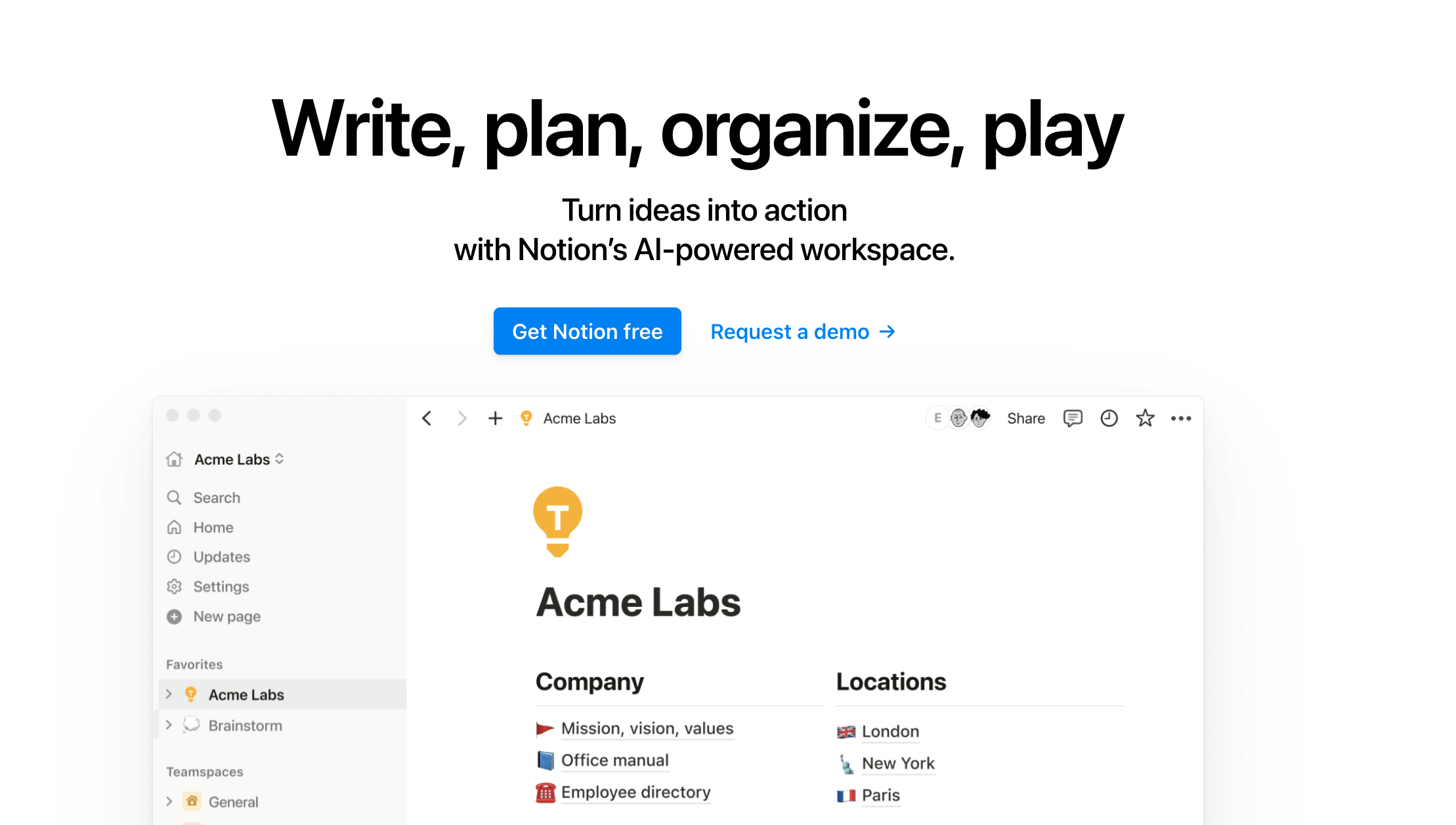
Let's first talk about the headline - 'Write, plan, organize, play.'
Honestly, it doesn't tell me anything about what Notion has to offer, what makes it different, and what’s the biggest benefit here.
You could literally pick this headline, add it to a random homepage and it would still make sense.
I am more curious about how Notion helps me with better, faster work.
'Get Notion free' is the best CTA for Notion. It will take users directly to try the platform and it will surprise them by simplifying complex tasks.
But, you know what’s not right?
Pairing it with another ‘request a demo’ CTA might not be the best idea.
Primary CTA is prompting the user towards a faster, more spontaneous action.
'Request a demo' might delay their decision to try Notion.
Adding 2 CTAs at the same place and leaving them to compete is a really bad idea. Even if 100 other SaaS websites are doing it doesn’t make it right for everyone.
We don’t need another “AI everything” app

The tab 'AI - Ask literally anything. Notion will answer' is itching me for all the right reasons.
AI has been mentioned twice now and I haven't even scrolled once. While I don't doubt the ease AI brings to create systems and frameworks on Notion, it doesn't really persuade me towards a strong action.
If AI was my goal, I wouldn't be here.
Another potential distraction - When I click on ‘learn more’, it takes me to a new page.
Why is this a bad idea for the homepage conversion rate?
AI is a great feature but not the selling point.
It takes users to the AI landing page and they might forget to return back to the homepage.
It might be a great value addition in the middle of my flow while I have seen all the best features Notion offers.
The static image below should be a GIF or a short video.

Don’t just tell me, show me

This section needs:
A video that shows a glimpse of how MetaLab creates workflows and replaces multiple tools using Notion.
How Justin leverages Notion and its integrations for Ops and Marketing
These changes would help a user visualize Notion just the way Justin does.
Powerful building blocks

Showing how Notion was powerful or minimal for Matchgroup is more attractive than reading a testimonial.
A before vs after of Matchgroup’s Notion implementation would be perfect here.
Where are the teams, side-by-side?

I’d like to see a notion doc that shows me 6 different teams collaborating on a single doc.
Individual team workflows are easy, but collaboration is tricky.
Copy doesn't do justice to the biggest selling point

This is the biggest selling point. I don’t use notion just because it’s a knowledge management tool, I use it because there’s a huge community helping me get through roadblocks, and resources that can be leveraged because people have already created amazing workflows.
BUT,
the copy/message isn’t supporting this emotion.
the benefits aren’t highlighted really well
Tell users more about how some people have based their whole business around being the notion ‘template’ guy/girl.
Show me how the community solved a major problem for a startup owner.
Show me live chats/conversations of these communities.
Real people persuade other real people like them. Fancy words and hyped numbers like 1M+ community members don’t motivate users to take action. They just fill the whitespace on the homepage.
‘Endless ways to use it’ seems exaggerated.

Loved how precise it is. But, adding links to the templates is a bad idea. Just show them these templates exist, and instead add a ‘get started for free’ CTA.
Great section, bad placement

Love the copy here. Only change - it should be combined with the section above and links to templates should be removed from the homepage.
Overall, I feel that Notion’s homepage isn’t doing justice to the immense value it gives users (including me). I don’t use words like ‘join a global movement’, ‘your AI everything app’, ‘write, plan, organize, play’ when I describe Notion to my friends. I use simple words and focus on showing them how it made my life easier.
That’s it folks! This was a micro teardown. For a detailed teardown of Notion, please subscribe.
If you want me to teardown your website homepage, pricing, or company page, please fill them out.